Thursday, September 26, 2013

Latest DegreeArt gallery, vyner st preview - portraits

I had meant to book 1 hr session to have portrait done but missed it.   U didnt have to buy but at least half were bought, £80, by the time of the preview on Tuesday.  Have been tweeting to get enough people to put name down to get artist, Ellie Young, to come back from Cardiff to do another few days, tho it would have been nice to be part of the original 'event'.  She did all these portraits over a few weeks.  Quite an event.


Fantastic app on Colour

By Yale University Press.  For ipad only i think.  Download free version to see what it is about.  Pay £6.99 for full interactive version.  It's basically the whole of Albers Classic book on colour theory that I was introduced to in my summer school class on colour.  Is going to take a while to get thru but a good reference i think.  Will see my teacher next week and ask his opinion.

It's interactive so u can read text then drag or change colours to apply theory or see how it works.


Saturday, August 24, 2013

Last of the Vyner St workshops - Deconstructing Deconstructions! with Patrick Simkins

Warning this wont make sense and the pictures are all at different angles as its just to remind me and I cant be bothered rotating pics.  I have included 2 works by the teacher who was an artist for the Olympics last year - a painting of athletes, and a head of a girl made with torn up paper pieces pined onto board.

The days was very freeing and results were surprising.  Will def try some more, some also in photoshop perhaps.

1. Looked at how representational art has been deconstructed thru the various art movements starting with impressionism and how current artists are doing it.

2. Drew in pencil a still life, 4 times under various restrictions - 40 secs, one continous line tc.

3. Drew portrait of person sitting next to us on top of 2 of the still lives

4. On 1 of these and one of the still lives with no portrait, traced geometric shaped cards - square, circle  etc.

5. The 2 pics without geometric shapes, we cut in half to give 4 halves.  On 2 halves coloured in contrasting colour with oil pastels.

6. Swapped a half with neighbour, taped to our own half then drew over it.

7. Coloured one of last 2 halves then cut into strips.  Kept 1/3 then putmrest into communal pile, taking back enough to glue onto a blank sheet to create a strip owrk.

8. On reamining 2 whole works that we have drawn geometrics on, we cuts out the shapes then used rest of the drawing a cuttout to place over strip picture to create new works reminiscent of some famous works we were shown - cant remember names at moment.

D

Wednesday, August 21, 2013

Thursday, July 25, 2013

Inroduction to Colour 1 day. Last of the summer schools

In the morning we we did analogue, complimentary and dominant colours in watercolour, tho mywatercolour  scene didn't work well. 

  In the afternoon learnt about colour mixing in oils using restricted colours to avoid muddiness and allowing colours to mix on the paper.  Its a really exciting idea and i now want to test it with variations on whites and greys.  The body i did worked better.  The idea is take only 3 colours (not primary, not too many earthy, not too similar, but strong and bright colours good).  Mix them to produce 7 colours, then add white to half of each of these 7 to produce lighter version and end up with 14 colours.  Because only started with 3 colours, means all the colours are related so will not turn muddy.   This rule applies to pastels because they all contain white so work well together.

Notes done in class:
True primary colours are Magenta, Cyan, Yellow (some paint ranges have these and of course are used on computers) and their secondaries are red, blue, green. 

Computer colours are additive, ie add them all together and u eventually get white.
Painting colours are subtractive, ie they add up to black.

Harmony in colour
1. Analogue - start with one colour, add another to make new, add another to make next etc.  these next to each other should harmonise.
2. Complimentary - opposite on colour wheel.  Look vibrant agsinst each other, eg red and green.
3. Dominant - full strength colour thru the various stages of watering down.

Two handouts pdfs to be added.

Two books:


Tuesday, July 23, 2013

Oil painting summer school 2 days

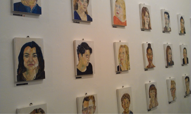
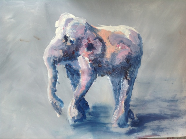
This was about handling oil paint not drawing.  We could use the still life objects or paint from imagination.  On first day i painted a wooden elephant while on second day i painted landscapes from imagination.

Day 1
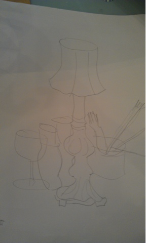
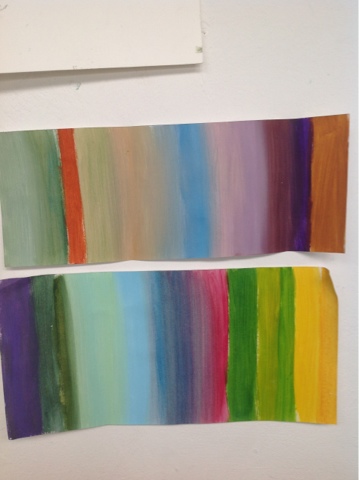
Creating slippery underpainting - ie slippery because done in oil and so doesn't dry, allowing moving and removing all day.  The orange brown still life using oil to paint object using 2 colours and  rag to remove paint for highlights.  This could them go on to form basis of a painting.

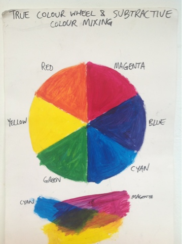
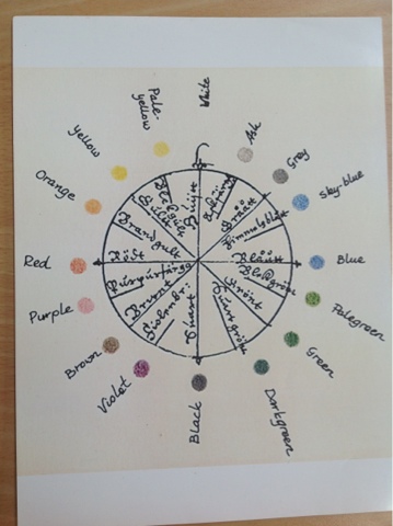
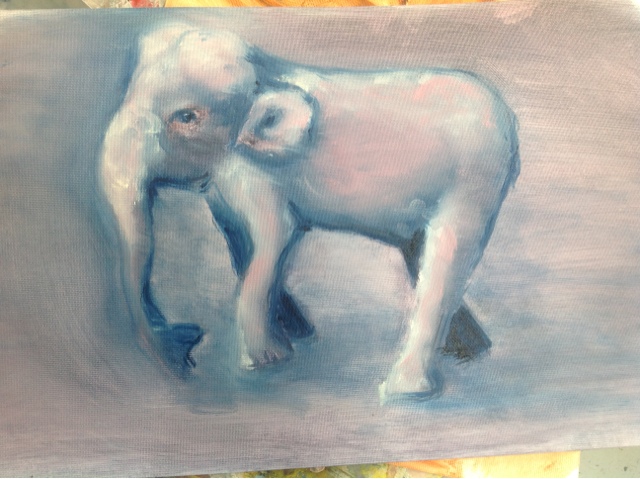
The palette, mixing colours. - The two elephants were about mixing colour on painting without ending up with muddy or grey mess.  Learning to put a stroke down and not mess with it too much.  The second elephant was blended with my finger and rag, again trying not to end up without muddy colours from too much mixing.  Its also about using correct colour combinations that don't equal brown or grey when mixed.  Still a lot more research to do on this. Some helpful motes given and on  thursday will do one day course with same teacher on colour.

Day 2 
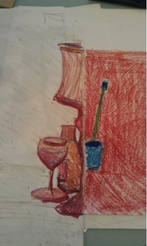
Overpainting over an acrylic underpainting. - teacher had painted white paper with acrylic backgrounds as a base for the oils - either gesso or acrylic is used under oils to protect canvass or other base from the oil.   We then had to do the underpainting in acrylic - white for highlights and one dark colour as shadows with the background as mid tones.  Because acrylic dries in minutes, we then painted in oils over the acrylic in thin transparent glazes of oil paints.   I found the backgrounds the teacher had painted inspiring and used them in my imagined landscapes.  First one was too busy when i had done my underpainting so i used it along with a head to experiment with glazes before trying on finally work, a more etherial grey seascape which the background paint had suggested.  I was happier with this, the only one i may keep or work on.

Glazes, mediums - we used either linseed oil, (also shown wax for body or stump oil)  to thin the colour down to a transparent glaze.   We also leanrt about colours that are transparent, those that are opaque, how to tell the difference, tranparent and opaque whites, lightening colours with oil rather than white for brighter glazes, using 80% similar colours and 20% contrasting/spots etc. etc.  have said it before but i need to read a lot more on colour.  It's important and interesting.

Sooooo much to learn about oil. Didnt find it easy but did love the slower drying process.  I had done oils before but this structured class was much more enlightening.


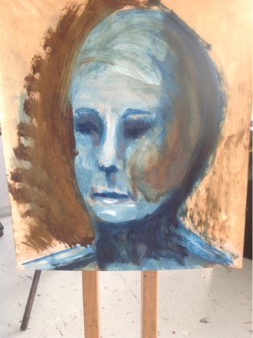
Oil underpainting of 2 browns and wiping out for highlights.


Putting down oil colours and leaving, without pushing around so to avoid muddying.  Done on acrylic background and u derpainting.

Tried blending colours with finger without muddying them.  Same underpainting as previous.

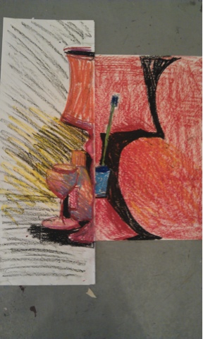
Trying out blue glazes over brown underpainting.


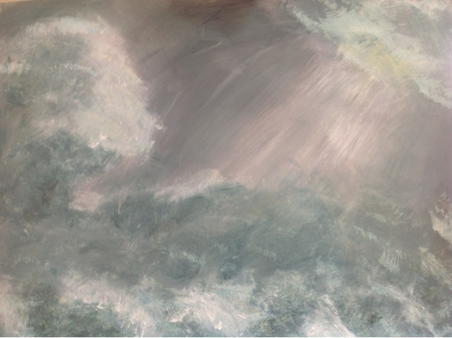
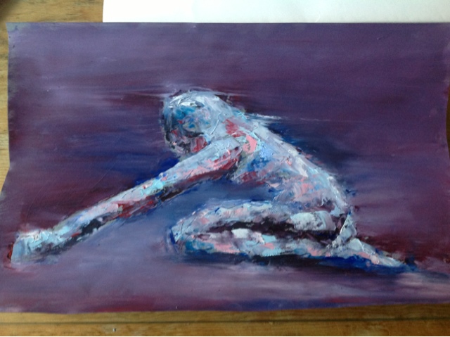
The underpainting was too busy so I used this painting to try out the blue and green grey glazes for my final work.

My final, favorite effort.