I have intense pencils and blocks, so must try this and as author says, heat set on a sample to make sure it sets.
http://www.quiltingdaily.com/blogs/quilting-daily/. a-new-method-for-painting-on-fabric-tips-for-using-inktense-blocks.
Sunday, July 28, 2013
Thursday, July 25, 2013
Inroduction to Colour 1 day. Last of the summer schools
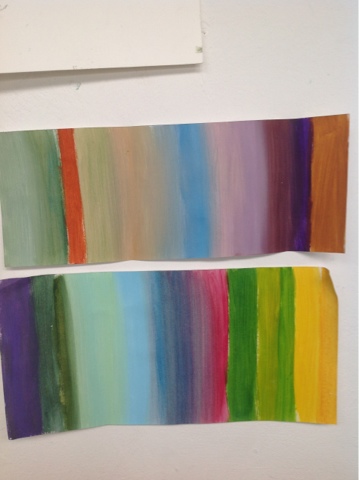
In the morning we we did analogue, complimentary and dominant colours in watercolour, tho mywatercolour scene didn't work well.
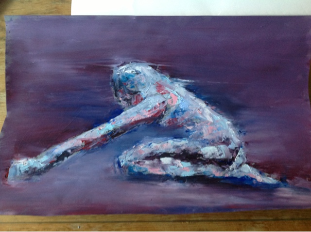
In the afternoon learnt about colour mixing in oils using restricted colours to avoid muddiness and allowing colours to mix on the paper. Its a really exciting idea and i now want to test it with variations on whites and greys. The body i did worked better. The idea is take only 3 colours (not primary, not too many earthy, not too similar, but strong and bright colours good). Mix them to produce 7 colours, then add white to half of each of these 7 to produce lighter version and end up with 14 colours. Because only started with 3 colours, means all the colours are related so will not turn muddy. This rule applies to pastels because they all contain white so work well together.
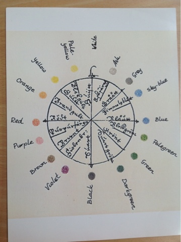
Notes done in class:
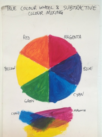
True primary colours are Magenta, Cyan, Yellow (some paint ranges have these and of course are used on computers) and their secondaries are red, blue, green.
Computer colours are additive, ie add them all together and u eventually get white.
Painting colours are subtractive, ie they add up to black.
Harmony in colour
1. Analogue - start with one colour, add another to make new, add another to make next etc. these next to each other should harmonise.
2. Complimentary - opposite on colour wheel. Look vibrant agsinst each other, eg red and green.


Tuesday, July 23, 2013
Oil painting summer school 2 days
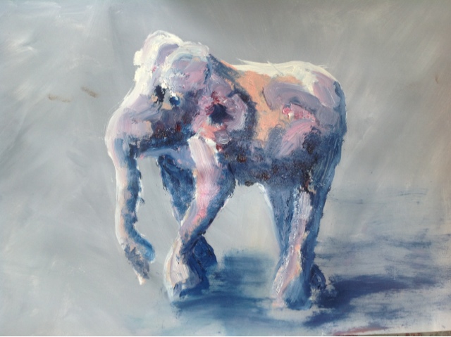
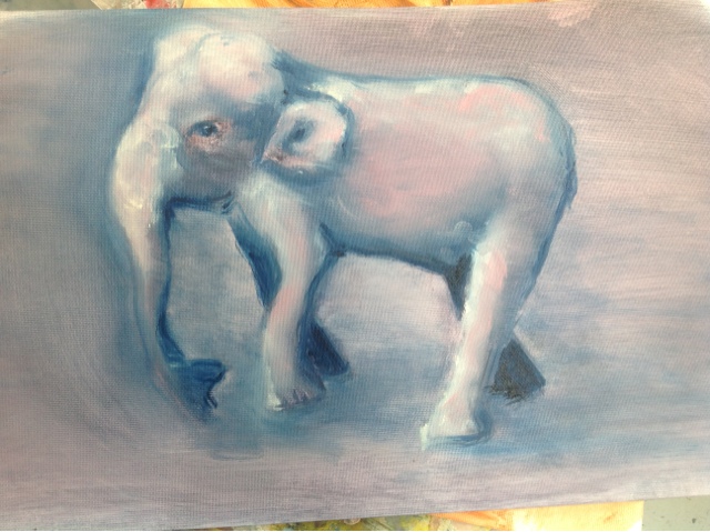
This was about handling oil paint not drawing. We could use the still life objects or paint from imagination. On first day i painted a wooden elephant while on second day i painted landscapes from imagination.
Creating slippery underpainting - ie slippery because done in oil and so doesn't dry, allowing moving and removing all day. The orange brown still life using oil to paint object using 2 colours and rag to remove paint for highlights. This could them go on to form basis of a painting.
The palette, mixing colours. - The two elephants were about mixing colour on painting without ending up with muddy or grey mess. Learning to put a stroke down and not mess with it too much. The second elephant was blended with my finger and rag, again trying not to end up without muddy colours from too much mixing. Its also about using correct colour combinations that don't equal brown or grey when mixed. Still a lot more research to do on this. Some helpful motes given and on thursday will do one day course with same teacher on colour.
Day 2
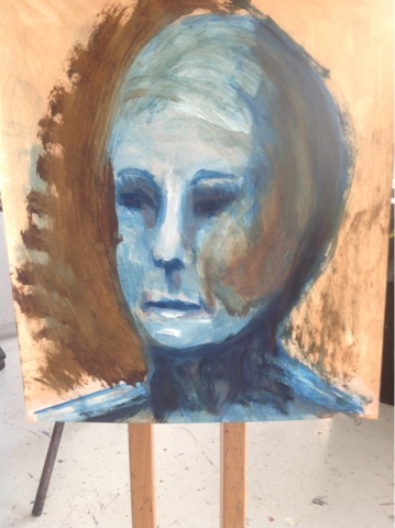
Overpainting over an acrylic underpainting. - teacher had painted white paper with acrylic backgrounds as a base for the oils - either gesso or acrylic is used under oils to protect canvass or other base from the oil. We then had to do the underpainting in acrylic - white for highlights and one dark colour as shadows with the background as mid tones. Because acrylic dries in minutes, we then painted in oils over the acrylic in thin transparent glazes of oil paints. I found the backgrounds the teacher had painted inspiring and used them in my imagined landscapes. First one was too busy when i had done my underpainting so i used it along with a head to experiment with glazes before trying on finally work, a more etherial grey seascape which the background paint had suggested. I was happier with this, the only one i may keep or work on.
Glazes, mediums - we used either linseed oil, (also shown wax for body or stump oil) to thin the colour down to a transparent glaze. We also leanrt about colours that are transparent, those that are opaque, how to tell the difference, tranparent and opaque whites, lightening colours with oil rather than white for brighter glazes, using 80% similar colours and 20% contrasting/spots etc. etc. have said it before but i need to read a lot more on colour. It's important and interesting.
Sooooo much to learn about oil. Didnt find it easy but did love the slower drying process. I had done oils before but this structured class was much more enlightening.


Oil underpainting of 2 browns and wiping out for highlights.
 |
| Putting down oil colours and leaving, without pushing around so to avoid muddying. Done on acrylic background and u derpainting. |
 |
| Tried blending colours with finger without muddying them. Same underpainting as previous. |
Trying out blue glazes over brown underpainting.

The underpainting was too busy so I used this painting to try out the blue and green grey glazes for my final work.
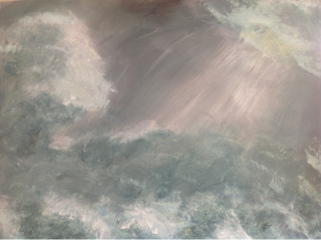
My final, favorite effort.
Saturday, July 6, 2013
Three day Portrait Summer School
Varying success but learnt a lot and discovered much better teacher. I have enrolled in his thursday evening classes. He is a young professional artist, exhibiting in London and New York - sad thought that even good artist has to earn money. He did teaching training early on so he was prepared and has taught in some good schools. This is his website. http://www.benjaminsenior.com


Cant believe i have him for free. He is more like the tutors I had at Westminster and has masses of great comments and tips, supportively pointing out errors. The other teacher i have had for past year makes few comments and most are useless cliched praise. She's old fashioned, doesn't have website and is terrified of my ipad drawing. I may cancel her class, not sure, at least its a free model session. So i will have thursday evenings and friday afternoons.(school has now divided 10 week terms into 2x 5 weeks so i haven't enrolled in nov/dec or jan/feb cold dark evenings tho i may enrol in them later). I feel much more enthusiastic about next years classes and making progress.
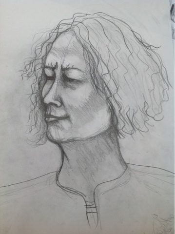
I got my portrait done by woman who has the style i aim for. My portrait of her was awful as u can see. We drew each drawing. When i said i wanted to learn to draw moving person she ended up moving a lot, i didn't, so i ended confusing perspective of her side and front views. I need sooo much more study and practice on proportions and perspective. This weekend i will spend on studying the library books i have on this subject and make notes. I need to know this stuff by heart.
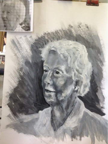
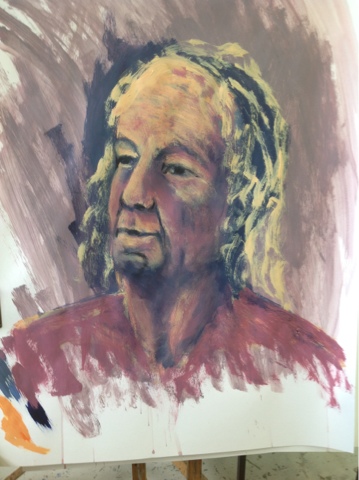
I am on ipad so cant get to label pics lower on page so - there are my poor portraits of male model who i just couldn't get. the third one is me almost ignoring him and just trying to get right head shape. Then more successful, if a little boring portrait of fellow student, older woman based on photo. Tutor took photos of us all the day before. Hated mine. You can see her photo attached to top left corner with a very handy grid he gave us all - a grid on acetate. We didn't add grid to work to scale up but simply used acetate grid to line up the features. This helped soo much in getting proportions right. I did a charcoal sketch first. The second pic is work in development and then one of it at the end of our time on the exercise.
Lastly is the portrait the woman did of me and her lovely drawing of the same man in my first drawing. Mine has crude shading and is more illustration. Hers is full of subtle toning and beautiful free expressive lines. Is great to have students better than me in class. Can learn a lot. Am usually somewhere in middle of class. In this one i was in top 1/4. That's some progress but more to do with who turns up.
 |
| Drawing from photo, marking in face facets first to help locate proportions and shading, tones and highlights. |
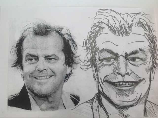 |
| We tried caricature |
 |
| My very bad portrait of woman who drew me. |

Two picture frames i made in class
There is only one £150 machinery i need. Everything else i found cheap substitutes for. I have more frames to make, including two for a friend when i can find the time. I have to a little each day. I am very slow so it would never make money. Like most crafts, it's hard to include all your time in the price. Still it will be useful for my own work and the occasional friend's.


Accidential fabric design
I was using bleach and got a few tiny spots on my favourite brown trousers. Dilemma. The spots were a lovely shade of orange and orange is in this year. On the other other hand I am too fat and old for a large orange bottom, yes bottom in all senses. But, since trousers will be too big by end of summer, i thought it would be fun experiment. Result? Love the pattern created by waving bleach bottle over trousers. Interesting that the lightest bits are at edge of bleach blobs. I like the marbled pattern, tho it does look a bit army camouflage and but i do look like a clown. I could tone down with brown dye, not really worth the money on dye, but maybe for experimental reasons. Quite summery anyway.

Subscribe to:
Posts (Atom)