
Wednesday, May 30, 2012
Colour Bar for transfer to phone
Colour - photographs unreliable
Just yesterday I had been reading an article in Artist magazine about why it is unreliable to paint from photos only. The article is right and Hockney is too - the camera lies - about depth
and colour etc - it's lenses can't do what our eyes do and it's colours
are interpretive. Though digital cameras a getting better and scanners
too - in their millions of colours - that's still less than we see and
it's heavily interpreted by lighting etc. My experiment has really made this clear for me.
I had been using the colour picker in Sketchbook app on my phone to pick colours from photos to paint them. I had also taken picture of a page in my Colour Mixing for Portraits book to pick colours from that. So, today I tried it on my desktop. I scanned in page from book this time to get better colour match than phone camera version. Then opened in Photoshop. My intention was to rearrange tiny patches of each colour down one side so I could use it on my phone - to overcome patches being painted over with my picture, therefore making it impossible to pick up the original colours. But once I started roaming over just one colour square with Photoshop's colour picker it changed between about 10 colours at least - you could see why as the squares show different colours in the picture below - eg. you can see brown and ochre in the master skin tone recipe square. I even scanned in at lower dpi but no good. So even adding picture of say John to colour pick from means I am not getting of John but of a camera's limited interpretation of it. Also, the squares of colour in the book itself have been interpreted by a camera, and in the picture below then interpreted by my scanner.
I wonder though if the digital process is really picking up the constituent colours of the square that our eyes put together in a Gestalt way to see the whole colour - just like the impressionist put yellow next to blue dots or dashes next to each other so we would see green from a distance - not sure this is the case here but I will investigate further.
Photos are useful but it's still best to see the real thing at least a few times.

Thursday, May 24, 2012
Shadows
My creative friend Kim thought I could help her with shadows on her quilt she is making. Though it was great for me to learn more about shadows and use photoshop in more depth, it just served to show how little I know. It does prove what my life drawing teacher told me - there's so much you can do with imagination but you also need to see figure in situ, even photos aren't as good as they flatten and never show the light and atmosphere accurately.
The trials of working out shadows without seeing the real thing. Sun is suppose to be at 11am.
Tree is set back from children, not sure how far.
New right child shadow - process
 1. select and copy child and save selection then fill in with paint bucket
2. flip vertically
3. rotate
Using perspective tool:


Shadow flipped horizontally definitely not right:

---------------------------------------------------------------------------------
Now I want to know more about shadows. I have begun my research.
I also had forgotten about 'about.com' and since I want to write up some colour basics for John this link is useful for both. about.com colour and shadow theory etc

Google images has some good tree shadow pics tree shadow pics on google search

THE SAGA OF THE SHADOWS CONTINUES
In the end it was Kim who worked it out. She enlisted the help of two models - her husband and a little manikin, spot the difference, and two light sources to create the shadows - the sun and a lamp - ingenious. Here is Kim's explaination of how the shadows at 11am really work with reference to her photos below.
'This was taken at the same time. Notice the shadow looks nothing like the figure. Also, how different the two shadows look, due to the compacting and extending of the figure.
It took until yesterday for the penny to drop as to what we were doing wrong. We were trying to make (and did make) reflections! It is so simple once you think about it. I knew something was not sitting right in the ideas that I and then you, were doing, but I just couldn’t put my finger on it.
We were looking at the figures sideways on, rather than from above. That is why the curved shape of the figures just didn’t sit well with me. You wouldn’t see the arching of the back from an above shadow. The shadow is blocked light, so all that is relevant, is that the light is blocked. The shadow then becomes the shape of the back area (or whatever extends from it) and would be flat.'


Thanks Kim for the lesson in persistence, investigation and really 'seeing' as an artist's basic tools. I look forward to seeing the final shadows on the quilt.
The trials of working out shadows without seeing the real thing. Sun is suppose to be at 11am.
Tree is set back from children, not sure how far.
 |
| 1. partically done by hand but shadows too long for 11am |
 |
| 2. shadows done with psd select to give more hard edge to shadows. Angle of right side child not in right direction. Shadows still too long. |
 |
| 3. Shadows shortened and right child shadow now in same direction as others but not sure it's right yet. |
 |
| 4. As always, drop shadows look better when combine with body shadows. Still the right child isn't right and I don't know what to do with it after 6 goes at position, rubbing out parts, resizing etc. Can someone go out and photo someone in 11am daylight sitting in same position? |
 |
| 5. there's nothing like a little distance to see what to change. after going away and doing some sewing it just seemed right to make right child's shade bigger. not sure if too big though? |
New right child shadow - process

2. flip vertically
3. rotate
4. position over child
5. shorten, rotate then cut out what is not what is wanted - this is where i have the problems. - - this is where the problems begin - size, position and how much to
cut. i am having problems with photoshop resizing - have to work out
how to use better - or get it near right then adjust by hand - maybe
need to work out how to use it's perspective tool.
 |
| shadow shortened and turned more |
 | |
| shadow cut away but leaving shadow on feet |
 | |
| shadow then cut away from body fully |
Using perspective tool:


Shadow flipped horizontally definitely not right:

---------------------------------------------------------------------------------
Now I want to know more about shadows. I have begun my research.
I also had forgotten about 'about.com' and since I want to write up some colour basics for John this link is useful for both. about.com colour and shadow theory etc
Google images has some good tree shadow pics tree shadow pics on google search
THE SAGA OF THE SHADOWS CONTINUES
In the end it was Kim who worked it out. She enlisted the help of two models - her husband and a little manikin, spot the difference, and two light sources to create the shadows - the sun and a lamp - ingenious. Here is Kim's explaination of how the shadows at 11am really work with reference to her photos below.
'This was taken at the same time. Notice the shadow looks nothing like the figure. Also, how different the two shadows look, due to the compacting and extending of the figure.
It took until yesterday for the penny to drop as to what we were doing wrong. We were trying to make (and did make) reflections! It is so simple once you think about it. I knew something was not sitting right in the ideas that I and then you, were doing, but I just couldn’t put my finger on it.
We were looking at the figures sideways on, rather than from above. That is why the curved shape of the figures just didn’t sit well with me. You wouldn’t see the arching of the back from an above shadow. The shadow is blocked light, so all that is relevant, is that the light is blocked. The shadow then becomes the shape of the back area (or whatever extends from it) and would be flat.'


Thanks Kim for the lesson in persistence, investigation and really 'seeing' as an artist's basic tools. I look forward to seeing the final shadows on the quilt.
Wednesday, May 23, 2012
More digital experimenting
I really liked the way my sky came out at tate modern, (post on this blog: http://www.blogger.com/blogger.g?blogID=5666531142704615592#editor/target=post;postID=46638880365825247) so I thought I would try another one - sky landscape - from imagination -ie no photo reference. Much harder. Trying to capture layers of sky and atmosphere. Won't finish this one, but will keep trying. If I get it right, I will try with watercolour or other media.


Messum's Gallery talk by David Tress
Just when I am trying to decide if I could leave London, I get an invite to a talk at Messum's by an artist I don't know takling about 40 years of painting - looks exciting - love the green pic at bottom and will be interested to just how the paint goes over the edge of the paper - almost looks like something you would do in Photoshop using background pattern as a brush but it's not.
You can see more of his work on Messum's site (great gallery in Cork St behind Royal Academy) http://www.messums.com/project-inventory/332.

His website with biography: http://www.davidtress.co.uk/
You can see more of his work on Messum's site (great gallery in Cork St behind Royal Academy) http://www.messums.com/project-inventory/332.

His website with biography: http://www.davidtress.co.uk/
Monday, May 21, 2012

Saturday, May 19, 2012
Two exhibtions - Yayoi Kusama at Tate Modern & Mondrian/Nicholson at Cautauld inspired more digital drawing
Productive day - 2 inspiring exhibitions and some resultant drawings. I nearly didn't go as I wasn't sure I would be interested - you never know where you'll find inspiration.
1. Kusama at Tate Modern - 83 yrs old 'best known living Japanese artist' - lives in mental institution with studio opposite - very interesting story, worth looking up - parents wouldn't let her do art when she was a child, she went to new york, became well known, burnt out and has lived in institution for years. Lot of 'dots' work - you may know it, not exactly my thing but I did like some of her clothing sculpture. But, one room wowed me - a small room, simple, completely dark with a walkway, walls and ceiling totally covered with mirror and with water on floor either side of shiny walkway - ie everything is reflected forever in everything, so that when hundred of dotty/little round coloured lights hanging from ceiling at different heights come on, you feel like you are in space amongst the stars. I am going back again and taking John to see just this room.

While in Tate, I did my usual of going to members rooms and drawing the view but this time I wanted to try out scibbly trace on a landsape so i took pic on phone and did quick trace drawing. I also experimented more with brush and eraser on different opacities to start doing some clouds.
2. Mondrian and Ben Nicholson at Cautauld - shows how inspired each other, both leading the development of geometric abstract. Just about 10 works each and some letters etc but very interesting and clarifying for me. They explored colour and shapes to get a simple balance, depth/flatness, simpleness - I am going to write a simple colour theory for John because this is the kind of work he would like to do and I think he would be a natural for it - I have asked him for one he did, to hang in my lounge - it may have been beginners luck, we'll see. He drew did 3 simple shapes on large grey painting. I had done the background in the colours/paint we used to decorate his flat a few years ago and he did the rest. It just works. I will blog a pic of it at some point.
I wanted to do something on the phone inspired by these works and to try using the apps bucket colour fill to do it.
While I was in the cafe, I wanted to try drawing a crowd scene using the phone. I don't know if my hand will learn to draw from the scibbly tracings. I hope so, they are such an instant fix. One day I hope to draw as quickly without the picture. It's amazing how it helps get perspective - different size people - and how it helps get expressions quickly - the woman on the right eating. Given more time and better photo, I could do even more.
John has just reset the phone so I have been able to buy and download a full version of Sketchbook so I am now off to play.
1. Kusama at Tate Modern - 83 yrs old 'best known living Japanese artist' - lives in mental institution with studio opposite - very interesting story, worth looking up - parents wouldn't let her do art when she was a child, she went to new york, became well known, burnt out and has lived in institution for years. Lot of 'dots' work - you may know it, not exactly my thing but I did like some of her clothing sculpture. But, one room wowed me - a small room, simple, completely dark with a walkway, walls and ceiling totally covered with mirror and with water on floor either side of shiny walkway - ie everything is reflected forever in everything, so that when hundred of dotty/little round coloured lights hanging from ceiling at different heights come on, you feel like you are in space amongst the stars. I am going back again and taking John to see just this room.
While in Tate, I did my usual of going to members rooms and drawing the view but this time I wanted to try out scibbly trace on a landsape so i took pic on phone and did quick trace drawing. I also experimented more with brush and eraser on different opacities to start doing some clouds.
 | |
| Photo of view of St Pauls from Tate Members Room |
 | |
| Clouds done with brush picking up colour from photo and eraser - both brush and eraser set on almost transparent. |
2. Mondrian and Ben Nicholson at Cautauld - shows how inspired each other, both leading the development of geometric abstract. Just about 10 works each and some letters etc but very interesting and clarifying for me. They explored colour and shapes to get a simple balance, depth/flatness, simpleness - I am going to write a simple colour theory for John because this is the kind of work he would like to do and I think he would be a natural for it - I have asked him for one he did, to hang in my lounge - it may have been beginners luck, we'll see. He drew did 3 simple shapes on large grey painting. I had done the background in the colours/paint we used to decorate his flat a few years ago and he did the rest. It just works. I will blog a pic of it at some point.
 | ||||||||
| Leaflet from todays show at the Cautauld - Mondrian top and Ben Nicholson bottom |
 |
| Mondrian inspired phone doodle |
 | |
| Nicholson inspired phone doodle |
 |
| Phone photo of Cautauld Cafe |
 | |
| A 5 minute scribbly trace on phone |
Wednesday, May 16, 2012
I love doing scribbly trace drawings of pics on phone
 |
| Edyta and her daughter Sophia done yesterday during lunch with them. |
 |
| John |
Remodelling small pjs
I can only show part of the pjs as I was wearing them when J took pic without me knowing and the rest of it shouldn't be seen by the world. I know it's not a clear pic and I will eventually take better pics of all the sewing I've been doing. You can see the buttons down the side - this is part of the top of the pjs.
They were originally nice M&S smooth cotton size 12 men's PJs which i never got to wear as i didn't quite make it down to that size. I am size 18/20 on the bottom so by cutting the top into 6 parts - 2 fronts, back in 2 halves and the 2 sleeves, I was able to get enough lenght to add 5 inch inserts into the sides. I usually add stiching on outside over seams to give a better finish so they look like they were always like that.
They were originally nice M&S smooth cotton size 12 men's PJs which i never got to wear as i didn't quite make it down to that size. I am size 18/20 on the bottom so by cutting the top into 6 parts - 2 fronts, back in 2 halves and the 2 sleeves, I was able to get enough lenght to add 5 inch inserts into the sides. I usually add stiching on outside over seams to give a better finish so they look like they were always like that.
 |
| Side showing the button half of the top's front. The other side has the button holes. |
Pink knitted mobile phone holder 1st prototype
 |
| Hangs around neck - closed |
 | |
| Open |
Monday, May 14, 2012
Windowsill herb growing experiment
Always had problems growing herbs. Sick of supermarket ones going off. This time the pack said water from below and this seems to helped.
 |
| Supermarket bought growing herbs: curly parsley, my fav sorrel and flat leaf Parsley. The Sorrel has now been growing 2 weeks. I am not sure whether it's losing some of its flavour though. |
 |
| Another experiment: the tallest leaves are from a twig of greenery, I know not what, that came in a bunch of flowers which has grown in this little vase of regularly refreshed water only, for over a year. So yesterday I took leftover bits from bunches of cut parsley and mint that was finished. I think the brown leaves were already dead but i will take and see how long they last. |
Drawing and painting on phone - me and Hockney
Am in heaven again - doing a blog on art discoveries while watching Two Hairy Bikers Mediterian cooking.
After playing with Autodesk's Sketchbook - free version (can't get paid version which gives more layers and brushes and features till i can get account of phone changed), I have found it fantastic. A few things have come up that I hadn't thought of but would equally apply to painting on canvas or on computer. For example I had this book for getting portraiture colour right.


I had scanned colour chart into computer and used the colour numbers shown in Photoshop, looked up in wikepeadia to get colour name in mixed colours - the book gives you recipes to mix the colours from basic colour set for each type of skin colour. Wasn't sure quite how I would use this. Then when i got the phone, I took pic of chart with new phone, imported it as background layer in Sketchbook, made another background layer with head structure and used the 3rd layer to work on.
I will definitely get the paid version when i can and also 'Brushes' used by Hockney on ipad when i have one.
Also here are the drawing pens I bought and made for the phone.
HOCKNEY
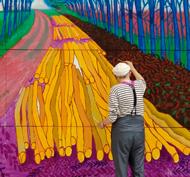
I loved Hockney's exhibition of landscapes mainly for their colour but really because of his amazing love of moving forwards. I am reading a book of interviews with him going back to the 80s and he's always been like this. I read his interesting study of use of camera's in art going back to Renaissance (use of camera lucida -lenses) - lots disagree with him, and his use of photos in 80s and 90s to explore cubism in his painting - this relates to how we see which the camera can't really replicate. Now in his 70s he's using digital media, still getting up at 5am everyday to work, painting outdoors in Yorkshire weather. The great thing he did in the Royal Academy exhibition was to show how using ipad allowed him to sketch the weather as it changed everyday before he did his large scale paintings - in the main hall you had one large oil painting made up of about 15 canvasses of a part of a wood in spring. On the other 3 walls you had about 40(only part of 100s he did) large ipad printouts of his sketches done from Feb to June showing the wood going in and out of spring - his sketches he did to do the painting. I love seeing artists sketchbooks. It was great to see how he could see the same scene so differently each day. He also showed how he has experimented with ipad drawing - because he knows he wants to print it out in huge printouts, he had to adjust his painting and setup on ipad accordingly. It's the first time the Royal Academy has given it's room to an artist to do contemporary work not finished till the exhibition and to large scale digital printouts as part of painters work. You can see Brian Sewell's critical review (i don't disagree with it all, I just love what he's doing to advance digital work) http://annecane.wordpress.com/2012/01/28/david-hockney-ra-a-bigger-picture-royal-academy-review-by-brian-sewell/
Some of his exhibition pics:
He says he'll probably go back to paintings portraits now. I look forward to them. But who knows what he'll get up to next.
So I wonder what he'll do with ipad portraits.
After playing with Autodesk's Sketchbook - free version (can't get paid version which gives more layers and brushes and features till i can get account of phone changed), I have found it fantastic. A few things have come up that I hadn't thought of but would equally apply to painting on canvas or on computer. For example I had this book for getting portraiture colour right.


 | |||||||
| Phone screen showing Sketchbook layers - background colour chart, 2nd layer head structure and 3rd layer to draw/paint on. |
 |
| I draw on top layer using head structure layer as guide. |
 |
| Then i turn off head structure layer to start to draw more to get likeness - not done here. |
 | |
| I can then use the apps colour picker to pick the colours from colour chart layer. This is easier than opening up the menu and selecting colour from colour menu and gives me exact colours. |
 |
| By moving to different colour the colour pick changes colour and you continue drawing or paintings. |
 |
| Building up the colours |
 |
| Continue to build and change colours |
 |
| You may see the problem here - once you start to build up colours you lose access to colour chart. I will have to build a version of this chart in photoshop so that the colour are small squares down one side of picture. |
 |
| I though it would be difficult drawing and painting on phone - the HTC Desire HD screen is just over an inch bigger than an iphone - but i have found the ease of zooming makes it easy enough to go in for detail and then come back to see how it looks in overall picture. |
 | ||
| The free version menu gives you, opacity and size change for pencil, brush, wider brush, streaky brush, spray paint, and a paint filler and eraser as well as access to colour swatches (you can add your own colour swatches but in this version you lose the original ones until you reset - i may just simply add in colours from my chart) also RGB sliders/ colour mixer and layer menu where you can import pics, turn up to 3 layers off and on, merge layers export picture showing any layers turned on. So, you can export versions of your picture then re import to add more layers. |
 | ||
| Once you can use more layers, you can add colours a bit at a time so you never mess up good beginnings. Then you can merge when you're happy - or as Hockney does on his ipad, show it as a animated movie of building the picture. |
 |
| Layer containing colour using the sprayer. |
 | |
| The previous 2 layers turned on and more added. |
Also here are the drawing pens I bought and made for the phone.
 |
| The one on the right is a brush version I bought for £10. The two on the left are ones I made using biro housings and cheap materials from Maplin: wire, conductive foam and aluminum tape. I have other material - conductive plastic i will try one day. I made short one for ease of carrying and long one to give a freeer ark to mark making. |
HOCKNEY
I loved Hockney's exhibition of landscapes mainly for their colour but really because of his amazing love of moving forwards. I am reading a book of interviews with him going back to the 80s and he's always been like this. I read his interesting study of use of camera's in art going back to Renaissance (use of camera lucida -lenses) - lots disagree with him, and his use of photos in 80s and 90s to explore cubism in his painting - this relates to how we see which the camera can't really replicate. Now in his 70s he's using digital media, still getting up at 5am everyday to work, painting outdoors in Yorkshire weather. The great thing he did in the Royal Academy exhibition was to show how using ipad allowed him to sketch the weather as it changed everyday before he did his large scale paintings - in the main hall you had one large oil painting made up of about 15 canvasses of a part of a wood in spring. On the other 3 walls you had about 40(only part of 100s he did) large ipad printouts of his sketches done from Feb to June showing the wood going in and out of spring - his sketches he did to do the painting. I love seeing artists sketchbooks. It was great to see how he could see the same scene so differently each day. He also showed how he has experimented with ipad drawing - because he knows he wants to print it out in huge printouts, he had to adjust his painting and setup on ipad accordingly. It's the first time the Royal Academy has given it's room to an artist to do contemporary work not finished till the exhibition and to large scale digital printouts as part of painters work. You can see Brian Sewell's critical review (i don't disagree with it all, I just love what he's doing to advance digital work) http://annecane.wordpress.com/2012/01/28/david-hockney-ra-a-bigger-picture-royal-academy-review-by-brian-sewell/
Some of his exhibition pics:
 | |
| The exhibtions main work that appeared on catalogue. |
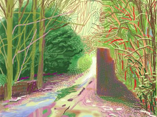 | |||
| One of the ipad printouts. |
 | |
| Hockney at work on ipad |
 | ||
| He sends new ipad flower pic to friends every morning before starting work. |
 |
| But he's still a painter - here working outdoors in Yorkshire on RA exhibtion work. |
 |
| Iconic photo collage work form 80s looking at how we see differently to camera - taking one picture would show flat screen whereas we see by focusing on different things with equal clarity because ours eyes can refocus at will as we flit around - so he took many pictures at different positions - eg he took pic of stop sign up a ladder near it. This theory was especially significant for capturing huge landscapes like the grand canyon which the camera flattens so is less like the reality we experience in being there. |
 | |
| He applied this way of looking to portraits. |
 |
| His mother. |
Subscribe to:
Posts (Atom)