Friday, August 3, 2012

Olympics - London Empty and Hasting & Margate eateries pay tribute to the Olympics

 Olympic London empty
 I had been dreading the Olympics.  Living next to the Olympic park I thought I would not be able to leave my house.  My road had half it's parking removed on one side with double yellow lines, so I thought it would be full on Olympic traffic even though its a very quiet back street.   Not only is my road empty - so is the whole of London - quiet eerie.  Not only have tourists stayed away, Londoners seem to have left town.  The little left residents parking in my street is virtually empty as is the rest of the streets around me.   By making sure I avoided intersections with new restricted or no turns I have been enoying the empty roads going into the Tate and the South Bank several times.  I feel sorry for shops and taxis etc as they are all losing business.  My friend John has just told me that places like Leicester Square are very busy - perhaps the Prime Minister's plea to everyone to now come to London rather than stay away, is beginning to work - I just checked the BBC traffic camera between me and the grounds - the main Olympic route the A12 is still pretty clear.


Hastings - The little tearoom next to Hastings Arts Forum (used to be called Jam Jars I think with a window full of jars you could add to)  runs a knitting club on Thursday evennings.  The kintting group have knitted a wonderfully fun and funny Olympics window display for the cafe.   Look out for the pink and white chairs in front of the pavement, opposite the new seafront restaurant, Azure) if you want to pop in for a chat with the friendly owner and locals.

Bet the ridiculous Olympic logo police don't know about these - Couldn't get rid of the reflections

Gymnastics amongst the rings.


Even Margates' Turner Contemporary Gallery has given itself an Olympics paint job.
Yes I know you can barely see it - the pink stripes on the gallery at the back - but I was enjoying my Fish and Chips too much to move.

Tracy Emin - 'She Lay Beneath the Sea' at Turner Contemporary, Margate

I had did a two hours dash from my Hastings visit to Margate on my way home, to see the latest Tracy Emin works (6 hours in the car - I could have gone to St Ives).  I've never been convinced and this didn't help. It took me about 10-15 mins to see it.  More large scrappy drawings, neons and gouches, monoprints and sculptures mainly of nude women with legs splayed and hands on groin - will she ever grow up and get over her past?  Do we?  Since she's been made Profesor of Drawing at the RCA I thought I should see if there is some lovely flow to her lines I that might inspire me, and there was a little.  But there was also the ugly, the disturbing and the scrappy writing.  

The 'prettiest' was the tapestries of yes, again, women with no heads, legs open and hands to groins.  I looked close, she surely didn't produce them did she? - and no she didn't.  A college did it to her design.

I could be wrong - as I went into the hallway, looking at further revealling (erotic?) drawings and rough watercolours of provocative nude women I detected an improvement - but then I noticed they were private works by Rodin (his Kiss is on loan downstairs in the gallery)  and J. W.Turner placed here for context.   The programme states that in the history of art where female eroticism, sex and the nude are usually presented by men, she presents it all from a female perspective.  I find hers less pretty and more confronting.  Maybe that's the point.

The reason for her title - I heard her explain it on TV a few months ago - not worth repeating - like Hirst, she's a story spinner in order to explain her work to us and herself - I rarely find it convincing.  It's her first solo exhibition in Margate where she grew up, and to which she is committed to help develop.
 
I really felt some of her drawings were taking the piss but I still can't completely dismiss her.

Tracy Emin - Rose Virgin Tapestry
Tracy Emin - Tapestry

Tracy Ein - Neon
Tracy Emin - Breakfast at the Grotto (I assume the Margate Grotto)
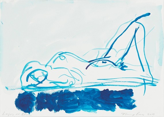
Tracy Emin - She Lay on Blue

It wasn't a waste.  I stopped in at my fav Margate seasfront Fish and Chip shop - great value.

ShirleyG - Fish & Chips Half Eaten, Erotically.  What's that hole?

My 3 New Pieces of Art - Artists Victoria Kiff, Alistair Kendry

I went back to Hastings yesterday to pick up the art I bought from my friends exhibition as the Hastings Arts Forum.  Alistair has another one at The Stables till the end of September.  From the poster I've seen, it looks full of wonderful colour.

After picking up the works I went to my fav part of the old town, the antiques market where I spotted Vickie buying a desk for her new studio.  We had a lovely chat over a coffee - always lovely to run into someone you know when you don't expect it.   I then had to dash off to Margate before heading home - see next post.

Victoria Kiff - 'Self Portrait with Death'.  (drypoint.  - she is lovely, really and as serene as her portrait.)
Alistair Kendry - 'Gold Leaf Letter' (reminds me of the work we did in class and the his huge gold works)

Alistair Kendry - 'Yellow House by the Sea' (small painted book - reminds me of his house on the Hastings seafront)

Making a Mark - Artist Business Survery and other handy links

In today's e-newsletter from Making a Mark, selling artists are wanted to participate in this year's survey of where best to sell art.  Even if you don't sell yet, it's worth seeing the results of last year's survey and the other useful links for artists - see links below.


Poppy Teffrey - St Ives Desinger

I found this designer in St Ives Cornwall and I get her e-newsletter.  I have added her to my fav sites today.  I love her sweet simple design.

 http://www.poppytreffry.co.uk/


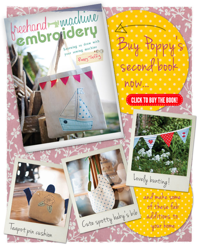
She has just published a book.


Tuesday, July 31, 2012

Frozen banana icecream - no cream

I am definately trying this out especially with the added ingredients.  Freeze bananas, whip up in food processor, serve straight away or add honey if you want.


http://www.thekitchn.com/how-to-make-creamy-ice-cream-w-93414?utm_campaign=topblock&utm_medium=web&utm_source=thekitchn-recipe

A Moan About Gallery Curations

I am always annoyed by the way we all have to huddle around the tiny description of gallery exhibits.  This means you have to do the gallery dance - back to see the picture and forward to read the description, then somewhere in between when you can't see the picture because everyone is in front reading the description.

This was especially noticeable in big shows like the recent David Hockney show at the Royal Academy.  Sometimes you couldn't get into the next room because there was a large huddle around the long description of each room near their entries.  Even though they were higher up and bigger text than the picture descriptions, there was lots more to read so the crowd grew bigger and bigger.  It was also very noticeable because Hockney is about grabbing new technologies.  Here were his great big ipad printouts - he'd used technology to work out to produce good quality prints from ipad drawings, so why couldn't the galleries have technology to provide a better way of giving us the information on the exhibit.

It also came home with a bang when I joined the Royal Academy - it costs me more per show to be a member but I avoid the queues.  So imagine my shock  when I discovered that while I use to pay £4 discount to get in and was given the catalogue to the shows free, now as a member they want to charge me for them. And, we're not talking about a £1.  They wanted £3.50 for the Summer Exhibition catalogue which is just a text list of the works for sale.


So here are my alternatives for curation (which I may send to galleries):


  • place picture descriptions in large text up high above the works, and room description high enough so it doesn't interfere with the pictures or the room entries.  I know some people like to experience  the work without the description but - if you don't like porn, don't watch it.  This way, people can stay standing back from the pictures to view them without anyone being too close to them, blocking the view and damaging old master works with our breaths etc. 
  • Most people have phones and apps now.  Make sure the gallery has free wireless access - I still can't believe most of the major galleries don't have this yet.  Make sure the gallery app has a section to access picture descriptions, room descriptions and information normally in the catalogues given out.   Those who want catalogue in hand can still buy them.  Any loss of revenue can be made by small charge online.  Members should have free access.   Less catalogues, less waste.  Most catalogues are over produced anyway for what they are - if you are only getting text with no pictures as is increasingly the case then just print out an A4 sheet cheap alternative.
  • The hand held voice descriptions of exhibits usually cost about £3.50 could also be put online for cheaper charge because there would be less maintance of the handheld devices.  Again members should get for free or discounted.
  • not sure i'm finished yet ..... gone away for a think
-----
 Postscript:

While I am on Royal Academy membership can I possibly start a members revolt - unlikely?
If it were not for the new members bar, restuarant and extra toilets etc opening next year, I would give it up - and still may after the novelty of the new has worn off and  I'm  bored with expensive prices for food and drink in the members room - they have actually written you can't bring in your own food to the current members room - not mentioned by any other major gallery I am a member of.  Just let them try that on me - I will suddenly have special dietary requirements.   If I do give it up  I will just have to negotiate a better way for disabled non members not to have to wait in line for an hour for tickets to the big shows.   I may still be able to get into members section enough times for my use: - I have given £1000 contribution to the new members building update - so we can have our names on the wall for a few decades at least, or a century with luck, after we've gone (cheaper than having kids to not remember us). I have been told I can phone up to gain access to members room to see our  names anytime I want, if I am no longer a member.  I should coco.

When you favourite PJs just don't fit anymore.

My friend Kim wanted pictures of my rescued PJs for her blog post on sewing - I even roughly ironed them which I don't normally bother with as they iron themselves as you wear them.  When you have favourite PJs: you love the colour or the fine cotton or the detailing, you just don't want to throw them out when you put on weight.  You will see from the pics below that I have put on a lot of weight so I definately didn't want to model them.

One thing I've learnt from making them, is that detailing should never be thrown out: it would have been quicker and therefore cheaper to have gone out and bought fabric and made them or even bought them ready made, but what I got to use was lots more detailing that would have taken ages to do - if I could have done it at all.

Tip: because you want details like cuffs to be at the bottom, get the length right because you wont' be able to taking up hems at the bottom - it's better to shorten the trousers at the top waist end if you have to, so don't put any detailing too close to the top.


There are 4 versions of my recycling pjs:
1. 2 different pj bottoms sewn together - the second one provide side inserts - the easiest to do.
2. a pj bottom with the pj top cut up to provide the side inserts - I don't like wearing PJ tops - I find them too constricting.  You get 2 front halves, 2 halves by cutting the back in 2, and 2 sleeves to open out - so you choose which bits to use where.
3. pj bottom with  a man's shirt (via my friend John's thrown out shirts) or other tops to provide the inserts - this was necessary because I had given some PJ tops to charity shops ages ago - you see why you shouldn't declutter too harshly!
4. Making lounging trousers from just old shirts - no trousers/pjs to start with - takes the most work as there are lots more joins.

You will notice they are very baggy legged.  This is not a design decision but is just easier to keep all inserts as straight pieces.  They sometimes go in a little if the sleeves used get narrower at the cuff.  They look like clowns pants but sooo comfy and, I can always draw in the elastic that magical day when I lose weight!  I must admit they are just as often lounging pants as when I get up I start doing things round the house in them and before I know it I've spent the day in them and need to put another pair on for bed.  That's why I need so many.

1. 2 pjs together - the simplest to do.
Blue strip pjs in centre and blue with writing on the sides - also added to the top to give extra space to my big arse.

Yes I really did buy a pair of pjs with beach bum written on them. Obviously the side pjs have had their crutches cut away but i kept as much as possible for big inserts.

Favourite flannel pjs with yellow bears (yes i did) added to favorite Addidas sports trousers to make warm winter lounging trousers.

Always loved the pockets on these.

2. a pj bottom with the pj top cut up to provide the side inserts

An M&S pair of men's PJs bought in Sex in the City days of fashion for wearing men's underwear etc.  The are really nice smooth cotton.  The button side of the top on the left and the button holes on the right with  the two sleeves opened out for the bottom half of the sides giving a piped cuff at the bottom.  The bottom of sleeves are good if they are big enough as you get the cuff detailing at the bottom.  Sometimes the back of the top can be cut in half to provide this bottom if the sleeves aren't big/long enough.


Top with pockets used for side inserts
Button side of top with pocket on lower side insert.


3. pj bottom with  a man's shirt for side inserts

Front top of shirt with button holes and pocket on upper side for side insert.

Sleeve with cuff and button opening as lower side insert

Shirt on sides with pjs in middle
A favourite 10 year old pair of pink pjs from Next, lovely cotton.  I used a spagetti strap top i would never wear from another pair of rose pjs to provide the inserts. 

My pink pjs are worn so thin at the back seam, that they needed a little arse support.  Haven't worn yet so not sure they will survive.  They are so cool on a hot day, probably because there's almost nothing there.


4. Making lounging trousers from just old shirts
When my friend John had seen how I'd used his shirt he wanted me to make him some.  I made the first pair out of his old linen shirts.  This was the first time I made pjs/lounging pants out of shirts entirely, with no trousers to start with and it took a lot longer.  There were lots of joins to add stitching to on the outside to make them look like a feature rather than a necessity.  This outside stitching is what I did to all my PJ joins.

The stitching I do on the outside on many of the joins - the white vertical stitching.  The black vertical stitching the horizontal white stitching is part of the original shirt.  This addes stitching always looks good in white and light colours.   On darker fabrics I often leave off the extra stitching as I think it looks better.  I will add it though if I feel the seem needs some flattening or neatening up from the outside, especially where you have to sew over thick joins and details like pockets etc.

John wasn't sure about all the joins but when friends commented on them and where they could get them, because of all the detailing, he decided he wanted another pair made of his old striped cotton shirts.  Because they were baggy lounging trousers, I found that I could use the curve of the armhole to form the crutch of the trousers -  I will update this post with these and the next pair I make him when I get them back from him.

The two shirts I will make Johns next lounging trousers from.

The pile of his shirts I have left to play with - and he use to criticise me for buying too many clothes!  He was going to throw them out but I kept the ones that either had lovely pattern, colour or fine cotton feel.   The better quality ones that don't have warn collars, holes or pen marks I will remodel to updated fashion style and/or resize them for him.  Others I will make into other things like trousers or even cover part of my sofa that is still showing some black leather after I covered the cushions in white and blue for a lighter look - so that the detailing shows - eg a sleeve cuff  or a pocket on the arm of my sofa.

Monday, July 30, 2012

Theatre - Last of the Haussman's at the National

J & I went to yesterday's matinee.  We are always worried when we go to the theatre because we are more often than not underwhelmed.  Not this time.  Funny lines, great actors and some social commentary thrown in- a very good first play for writer Stephen Beresford.  A dysfunctional family on the edge of disintegration.  Perhaps not quite Checkov but definitely more laughs.   J could see a touch of Noel Coward's 'Hay Fever'  we'd seen at Theatre on Lake in the Lake District last year.  

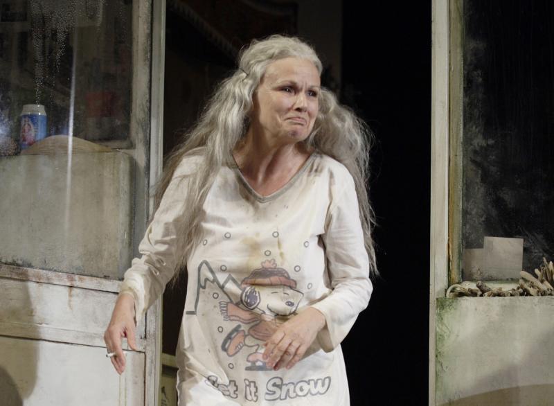
The ever wonderful Julie Walters plays the dying hippy mother - master of comic timing.  I've loved her in her TV and movie roles and I want to see more of her theatre work.  Just look at her - all that warmth, humianity and full of life energy she brings to all her roles.

Julie Walter in Last of the Hauffmans

Rory Kinnear plays her wastral gay son beautifully. - great contolled performance that makes you laugh and love him.  He deserves all the awards he gets and I will certainly see plays he is in from now just because I know I will see a great performance - yes I know I have been slow catching on.  I didn't know he was the son of a comic actor I loced in old movies but had never known his name or of the work he did outside films, and I didn't know he had died when he was 54 in a horse riding accident when Rory was 10. 
Rory Kinnear in Last of the Hauffmans


Rory's father Roy Kinnear


Article on Rory talking about his father: http://www.telegraph.co.uk/culture/tvandradio/3670797/Rory-Kinnear-becoming-an-actor-was-a-way-of-getting-to-know-my-father-better.html

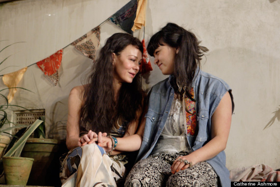
Helen McCory plays the angry daughter with her own 15 year daughter problems (daughter played Isabella Laughland by who I am sure we'll see lot more of in the future), with great passion.  Because I was up in the circle, I didn't recognise her from all her TV roles.  Not suprising as she can make herself look very different - just look her up on google images.  Looked fabulous in her tight jeans and the beautiful black velvet baggy trousers with wonderful white baggy chiffon blouse.   She is married to  who had the lead role in the great US series Homeland which is one of the few that I will probably watch a second series of.   They live here in LA while he works there.
Helen Mcrory, on the left, looking half her age in Last of the Hauffmans with Isabella Laughland who plays her daugher.

Helen Mcrory with her usual powerful look seen in many a good TV drama.

Helen Mcrory with her husband Damien Lewis, both having that perfect LA look.


Matthew Marsh plays the devious?(I missed whether he gets the house) doctor with the usual flair I am used to seeing in his many TV roles yet here I saw more fun and funny side that he doesn't often get to play on TV.
Matthew Marsh in Last of the Haussmans


Taron Egerton plays his first professional stage role after graduating from RADA this summer.  It's a difficult role with little dialogue for ages, having to be slightly creepy, menacing and innocent all at the same time for the first half of the play, which he manages to carry off.

Taron Egerton in Last of the Haussmans


Ikea shopping - I was only suppose to buy the bloody bottle

I only went to Ikea for the £1.29 water bottles, then the White Mist took over. 

My friend John wanted a blue version of the pink flat Ikea water bottle that fits in nicely to a flat satchel without creating bulk.  But then my love of 'White'  just took over and 8 great value white picture frames and other white items later I had spent £100.   And, 10 packs of their lovely Espresso ground coffee to keep me jumping for another 3 months. 

 Prices are vague because I had to work out from receipt - nothing was over £10 - most under £6.


Picture 1
Picture 1
  • The glass white top for £10 makes a great chopping board - I prefer glass for hygeine and the other little ones are too small.  
  • The large white vase is really a garden candle holder and was either £2 or £5 - only things on receipt I wasn't sure of.
  • The little white garaffe - £6 will be lovely for homemade lemonade.
  • The tall white thermos is so elegant and great for extra coffee/hot water/or iced drinks.  £5
  • The small round white thermos is one I got at a charity shop for £2 ages ago.
  • and yes, the bloody water bottle for £1.29 (Ikea family member price)  £2 otherwise.


 Picture 2
Picture 2
  • The big teacup with rose in the middle was £3.50 and bought for my parsley plant - just the right size to hide the black plastic pot.  
  • The beige mug on the right was 1.70 - yes i already had a white one I use for cutlery on the left, but this one looked yummy coffee colour and make my coffee taste better - really!  I will wear it out with the 10 packs of coffee.
Spent about 3 hours in all, getting ideas of how to transform small spaces, having a very cheap breakfast and on the way out, an ice-cream.   For those on tight budgets going to Ikea to eat out,  early during the week especially when the Olympics are on and the school holidays mean most people have gone away or staying off the roads, is a great choice.